Our big shiny rebrand
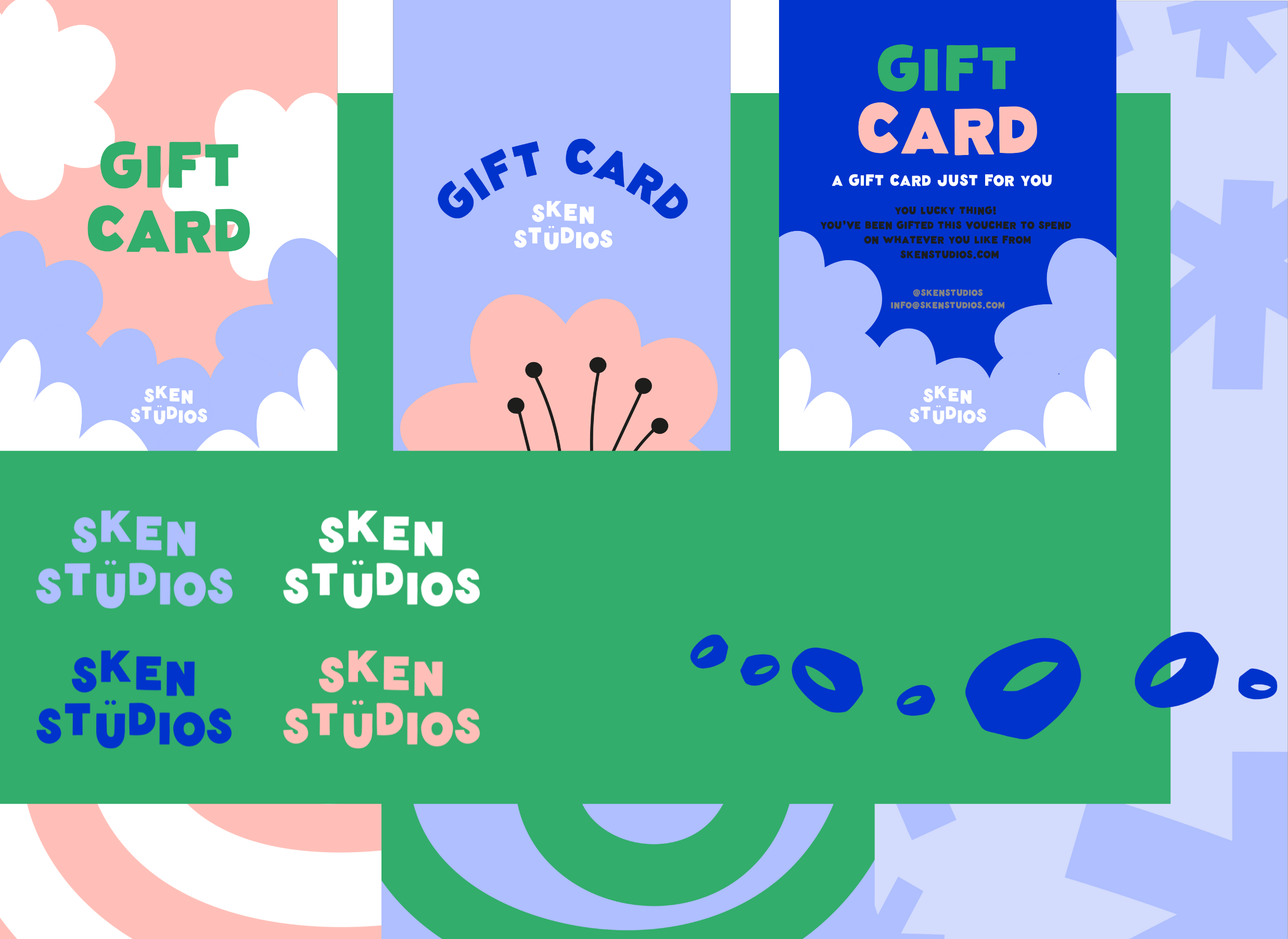
It’s been a busy few months at Sken HQ! I’m bursting with pride about all of the big changes recently and the rebrand is pretty high on the list. We worked with graphic design whizz Laura Christou, who took all of my chaotic ideas and turned them into the crisp, cool branding you see today.
We’re going through a process of phasing out all of our old packaging (you know we hate waste here at Sken) but in the next few weeks you’ll start to see your orders turning up in shiny new boxes and I couldn’t be more excited. Here’s a more in-depth walk through the rebrand and what it represents. Hope you love it as much as we do!
the logo
It’s chunky, funky and has a lil smiley in the centre. Need I say more?
Meet The Icons’ - EXPECT TO SEE MORE OF THESE LITTLE GUYS
The signet - Our ultimate fave products and clearly yours too - our signets are our best sellers. It only felt right to include one with a cheeky little grin.
The sparkle - “To glow or to shine” is the definition of Sken and that’s how we hope you feel when you were our jewels.
The flower - We went back to the archives for this gal. The flower motif is one we use a lot in our jewellery (hello petal hoops ) but you may not know that the first piece I designed for Sken was the indifferent daisy pendant. Before Sken was Sken, there was a moody looking flower.
The spiral - Spirals represent growth, change and continuous motion which this small biz knows a lot about. Going from scribbled iPhone drawings of grumpy flowers to a brand new studio and bags of new designs - we find it hard to stand still. Don’t be surprised if you see the spiral motif appear in future designs.
The palette
Cobalt blue - Colour-matched to blue jewellers wax. This material is where all our signets start out, before they’re cast in silver.
Green - We’re committed to sustainability. From our recycled silver to our second-hand jewellers bench.
Pink - We couldn’t let our fave colour slide. An updated version of our previous logo pink.
Parma violet - A fresher take on the colour of 2023 “digital lavender”, this cool blue is the cherry on top of our brand new palette!
Thanks for coming to my TED Talk, hope you love the new branding as much as I do.
Sabira x
